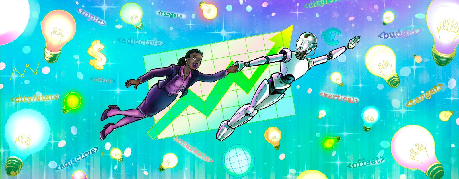
With many people still confined to their homes, an online business is the perfect solution to the world we currently live in. However, every business needs to be promoted and banner ads are a highly effective way to do this online. So, in this post we’ll cover the basics of website banner design so you can create your own banner.
Banner ads are advertisements that put a business in front of people who otherwise wouldn’t know about it.
Clicking on your banner takes them to a landing page on your website, where you present an offer to them.
Editor's note: GoDaddy now has a hosting centre located in India, enabling faster load times and better security for customer websites. You can read more here.
What exactly is a banner ad?
Typically, a banner makes an offer in order to get people to click for more information. Think of clear, big and bold messages printed on them:
- ‘Festival Sale!’
- ‘Hurry!’
- ‘Subscribe Now!’
- ‘Limited Time Offer!’
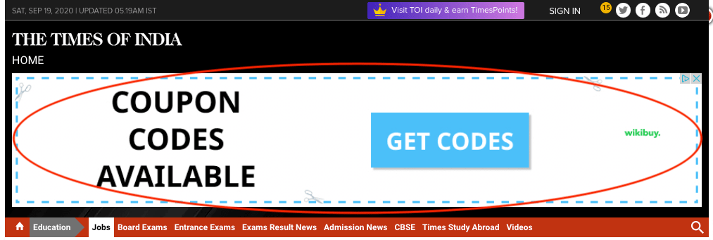
Every banner has a call to action (CTA) button like the big blue “GET CODES” button below.
When is a banner ad useful?
Let’s take for example, the string of Indian festivals. The tradition of gifting during the endearing festivals of Rakish Bandhan and Diwali can be highlighted on a banner with warm visuals of tying a Rakhi or the lighting of lamps with a pile of colourfully wrapped gifts. The exchange of traditional sweets, radiant smiles are other powerful images for an online gift gallery, tempting the viewer into purchasing gifts for their loved ones from the store.
The current pandemic is another example. Notice the ‘City Covid Number’ banners with an action button directed to a website with related information, floating on various websites.
Film promos are also up on banners to increase viewership and visibility.
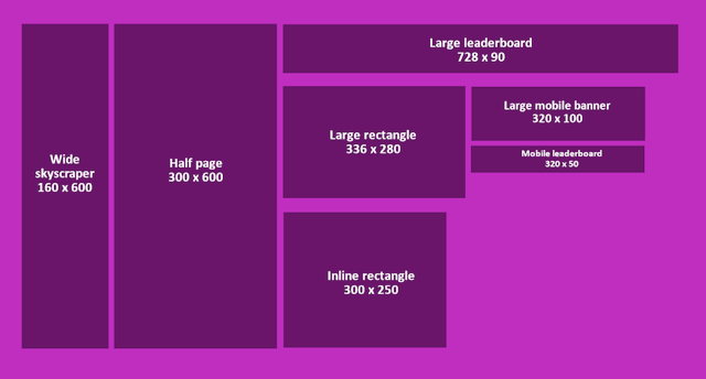
Standard sizes of banners
Every large website such as Google, Amazon, Facebook and LinkedIn has its own banner sizes. But these are the styles you’ll have to choose from:
- Leaderboard: Displayed at the top or bottom of a webpage.
- Skyscraper: Tall spaces, accommodated on the right or left sides of a webpage.
- Wide skyscraper: Tall and rectangular. Both skyscraper and wide skyscrapers are very hard to miss.
- Half page: Large space with ample elbow room for more graphics and visuals, if needed
- Medium rectangle: Medium sized rectangle.
- Large rectangle: Larger than medium sized rectangle.
- Mobile leaderboard: Suitable for mobile interfaces.
Below are the standard sizes for the year 2020.
According to Google Adsense, the most successful types of banner ads are:
- Leaderboard
- Half page
- Medium rectangle
- Large rectangle
Banner size standards are updated every year and it’s best to design to the standards. Choosing a different size from these standards could mean wasted effort and increased costs.
Ready to try your hand at web banner design?
A good web banner design captures attention within the first couple of seconds. Here are seven steps to follow when creating a banner ad:
1. Use a visually rich image
Scientific and calibrated studies have proved that our ability to process images is about 60,000 times faster than text. However, a generic image may barely garner interest. Create or choose images that entice a potential customer to stop and read the text.
Remember that the image on the banner is the first impression you give viewers. The more interesting, creative and emotionally rich it is, the more clicks your ad will get.
2. Static or animated?
A static (non-moving) website banner design has a still image, along with text in a JPEG, PNG or GIF format. These are non-interactive and attract less attention.
Because animated banners are interactive, they generate greater curiosity.
The format for these is typically GIF, HTML5 or Flash. HTML5 is the most convenient of all because it requires no additional software plugins to view the ad. HTML5 is also supported by all browsers. However, animated GIFs can suffer quality deficit and Flash files require plugins in order for people to see them.
3. Choose your colors carefully
Color is one of the most powerful tools of nonverbal communication. It triggers strong emotions and has a direct influence on likeability. For this reason, color is a critical choice in your website banner design.
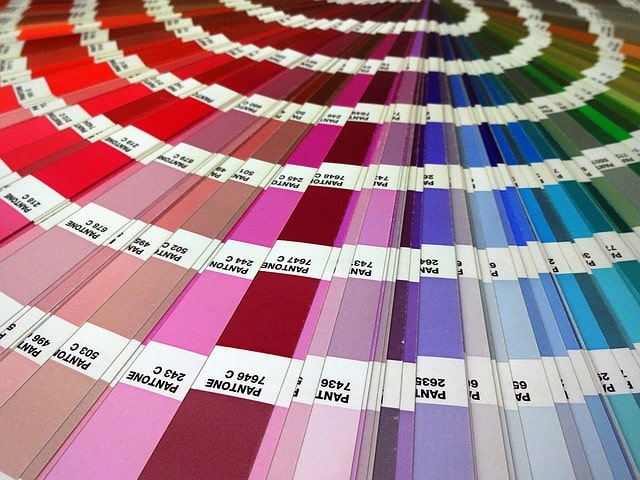
The reason for whether your product is purchased or not may well lie behind something as humble as color. The powerful subconscious influences conversions!
Men and women exhibit differences in choice of color palettes, so it’s a good idea to study the latest on color preferences before designing a banner, if your product is gender-specific.
If your product is unisex, pick colors that represent your business best for your website banner design, keeping in mind that every color evokes a certain emotion. For example:
Blue
This color is used by Facebook, LinkedIn, Dell, Ford, GE, Lufthansa and MakeMyTrip.com and is intended to emphasize trust, stability and comfort.
Black
Black is often used by luxury stores such as Chanel and Gucci for their websites. It calls to mind a feeling of elegance, glamour and sophistication. ShoppersStop uses black as an accent for these reasons.
Yellow
This is the color of sunshine and radiates a sense of cheer and friendliness. The bookstore Crossword uses this colour, from the bright yellow interiors of their physical stores to their online store as well!
Purple
Purple stands for luxury, royalty, extravagance, wisdom, femininity and creativity. It can soothe and relax the senses. PurpleDip.com is an online store with enchanting exhibits taking you back in time. Art, heritage and royalty oozes out of every piece of decor exhibited.
Pro colour tip: Ensure your banner has one dominant color with one or two secondary colors. If you use more colors than this, you might just drive away a potential customer. Although in some cases, if balanced well, this can work too! Carefully consider your options and align your banner colors with your website and logo colors.
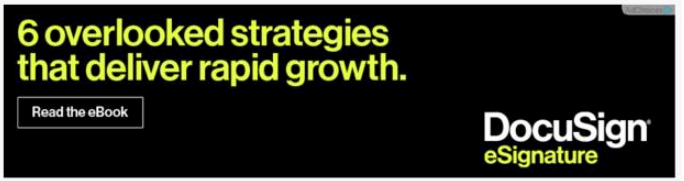
4. Keep your call-to-action short
After drawing attention to itself, the banner has to send the user to your website. This is achieved by a CTA on the banner.
Tell them exactly what to do next — “Browse more colors,” “Get your free sample” etc.
Banners with CTAs reach more than 200% more than banners without. If you want to increase leads, include a clearly visible CTA with simple action-oriented text that will prompt the reader to click and proceed to your website.
5. Keep a tight focus
Keep the banner precise, concise and focused. Avoid clutter, and drive a single, compelling message that should tempt the visitor into visiting your website.
Vague messages will only result in inaction and the purpose of a banner is completely lost.
A typical banner has a:
- Logo
- Image
- Line of text
- Call-to-action button
The simpler you keep it, the lesser the distraction.
6. Text
Make sure the headline and other text are distinct and set in different type sizes. The copy should be short and not exceed more than three to four lines. Do not use more than two font types. Avoid fonts in cursive writing.
7. Use urgency to your advantage
The purpose of a banner ad is to communicate a sense of urgency, both visually and in text. The way to achieve this visually is to apply contrasting and bold colors.
Put a deadline on your offer — this makes people click for fear of losing out.
The text must be carefully thought out, apt and have the right effect on the users.
Let the website banner designing begin!
A banner ad can help your business grow exponentially. To recap, here are the basics of good web banner design:
- Incorporate a crisp, clean and compelling message and powerful and evocative imagery.
- Include a sense of excitement and urgency.
- Stand distinctly different to be noticed.
A well thought out website banner design is the gateway to success in the online world!
________________________________
Start taking back your day
We built the Hub by GoDaddy Pro to save you time. Lots of time. Our members report saving an average three hours each month for every client website they maintain. Are you ready to take back that kind of time?